QMS by Reliance
During my two-month internship at Reliance General Insurance as a Product Designer, I had the opportunity to work on several impactful projects. By the end of my internship, I was honored to receive an extension offer from the CTO to contribute to a new initiative.
One of the key projects I worked on was the Quotation Management System (QMS). To put it simply, QMS is a tool that streamlines the process of managing insurance quotes. Here’s a practical example: When you decide to purchase insurance from Company A, the company calculates a premium based on your specific needs, which is then presented as a quote. Our QMS application efficiently handles these quotes for various roles and users within Reliance, making it an invaluable company-facing tool. It ensures that every quote is managed accurately and efficiently, enhancing the overall user experience for both employees and clients.
Insurance // Product Design // Contextual Enquiry
Timeline
Jan - May 22’
Results:
Results:


Existing Architecture
HDFC Bank's website hadn’t been updated since 2005. It was so outdated and bulky that SEO crawlers couldn’t even map out its structure.
For an entire month, I manually went through every single page of the site. I entered each page into an Excel sheet, identified broken links, found redundant content, and came up with a plan to reorganize everything. This hands-on approach revealed the true scope of the website’s Information Architecture and set the stage for a complete overhaul.

First Roadblock
We hit a technical challenge when we realized that manually rearranging pages and compressing topics within excel wasn't going to be feasible. To solve this, we conducted a thorough analysis of different diagramming tools. We carefully compared these tools using a set of specific criteria, and we did this analysis to choose the best tool for our needs.
Solution
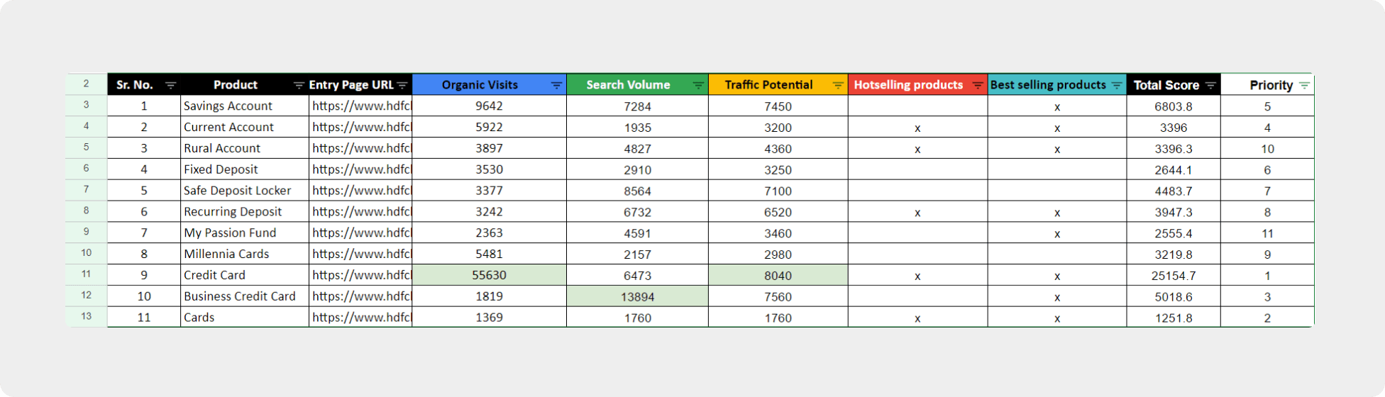
In our project, we improved webpage rankings using the 'weighted average method.' We evaluated key metrics like search volumes and organic visits, most visited pages, hot-selling products, assigning weights to each based on their importance. Our scoring system ensured balanced rankings, directing users to the most relevant content efficiently. This technique significantly enhanced user experience by prioritizing valuable pages.
Reflections:
Reflecting on my six-month internship, I am profoundly grateful for the experience. The project was vast and impactful, with much more ahead in the coming year. Knowing my contributions were valued and receiving an open invitation from my manager to return whenever I choose is truly touching. It’s more than a professional opportunity; it’s a testament to the meaningful relationships and the significant work we've accomplished together.
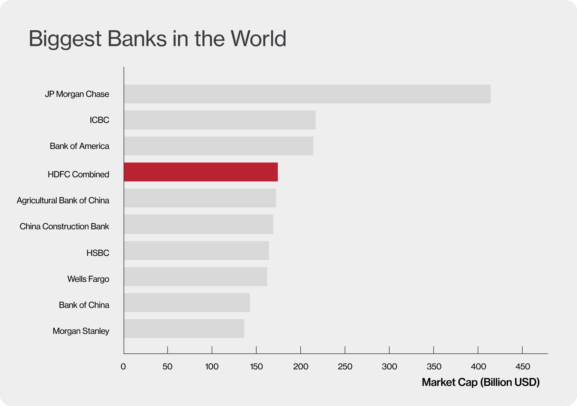
HDFC Bank is the largest private sector bank in India. I helped them revamp their website by creating an Information Architecture and organizing over 40,000 pages.
As of July 2023, HDFC and HDFC Bank underwent a monumental merger. This merger would place them at the 4th position for the biggest banks in India.
Healthcare// Product Design// Contextual Enquiry
HDFC Bank
Results:
- Achieved an SUS score of 87 during prelaunch testing
- Reduced user errors by 67%, greatly enhancing interaction accuracy and reliability.
Timeline
Dec 22'- July 23’
Disciplines
Information Architecture
Existing Architecture
HDFC Bank's website hadn’t been updated since 2005. It was so outdated and bulky that SEO crawlers couldn’t even map out its structure.
For an entire month, I manually went through every single page of the site. I entered each page into an Excel sheet, identified broken links, found redundant content, and came up with a plan to reorganize everything. This hands-on approach revealed the true scope of the website’s Information Architecture and set the stage for a complete overhaul.
First Roadblock
We hit a technical challenge when we realized that manually rearranging pages and compressing topics within excel wasn't going to be feasible. To solve this, we conducted a thorough analysis of different diagramming tools. We carefully compared these tools using a set of specific criteria, and we did this analysis to choose the best tool for our needs.
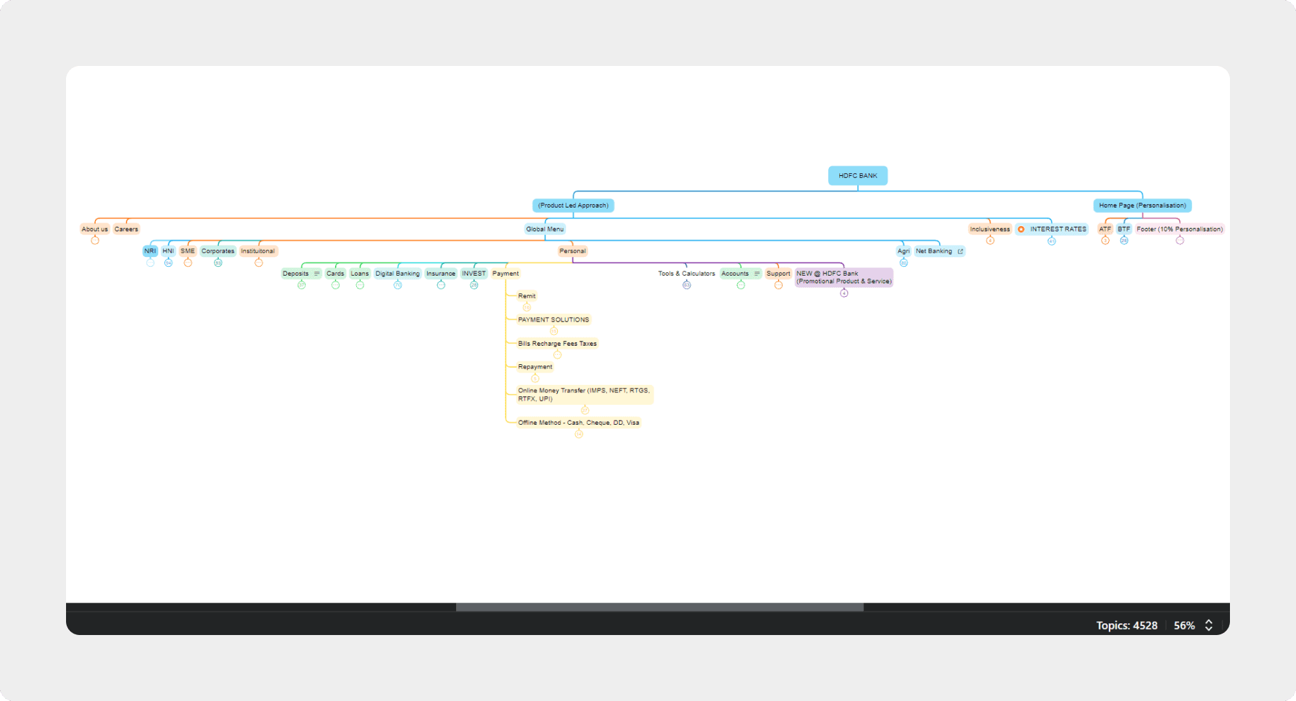
XMind
After comparing different tools for our brainstorming and IA needs, we chose XMind over others like Microsoft Excel. While Excel was familiar, it didn't offer the depth and flexibility we needed. XMind's intuitive mind-mapping features allowed us to easily visualize complex ideas. Its customization options helped us create precise diagrams that clearly showcased our thought processes. Essentially, XMind became an extension of our thinking, helping us present our ideas more effectively.
This switch not only made the Information Architecture process smoother but also significantly reduced implementation time, ensuring efficient integration after the merger.
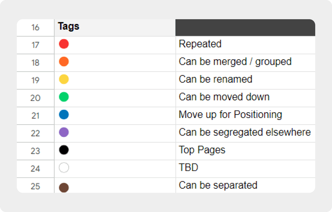
Weighted Average Method
In our project, we improved webpage rankings using the 'weighted average method.' We evaluated key metrics like search volumes and organic visits, most visited pages, hot-selling products, assigning weights to each based on their importance. Our scoring system ensured balanced rankings, directing users to the most relevant content efficiently. This technique significantly enhanced user experience by prioritizing valuable pages.
Aryan Roy
© 2024
© 2024
Aryan Roy
© 2024
Aryan Roy


Need for a Website & App
Existing Architecture
The website was our first major endeavor. My design process is unique—before I start, I envision a specific asset that guides the entire design. It could be an icon, a typeface, a color, or even something abstract. For this project, I imagined a hero image: a captivating illustration of our beloved Student Plaza.
The Student Plaza is the heartbeat of our college. It's where life truly unfolds—where we unwind, catch up with friends, share laughter, and create unforgettable memories. It’s more than just a place; it’s a symbol of connection and community. This plaza embodies everything the MIT Student Council strives to be—approachable, vibrant, and central to student life. Our goal for the website was to reflect this essence, ensuring it felt just as welcoming and integral as the Student Plaza itself.